


The 5th Dimension (c. 1968) photo source: Getty Images
Paper is flat.
Paper has only two dimensions, length and width.. However, most business decisions require executives to weigh multiple variables at the same time. Representing more than two variables is challenging. One can get away with representing three dimensions where the third dimension goes “into” the paper. The resultant image is just a projection of a three-dimensional object onto a two-dimensional sheet of paper.
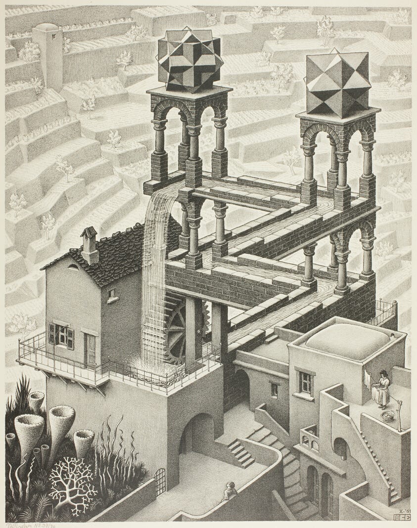
“Waterfall” by M.C. Escher (1961). Image source: Art Institute of Chicago
(Note: Whenever I use the framework described here, I think about the satirical novella Flatland (1884) by Edwin Abbott Abbott (and yes, that really is his name). In his book the world is two-dimensional, length and width (no height), and inhabited by geometric figures with different numbers of sides. In the Flatland caste system, the more sides a character has the higher in society is the character.)
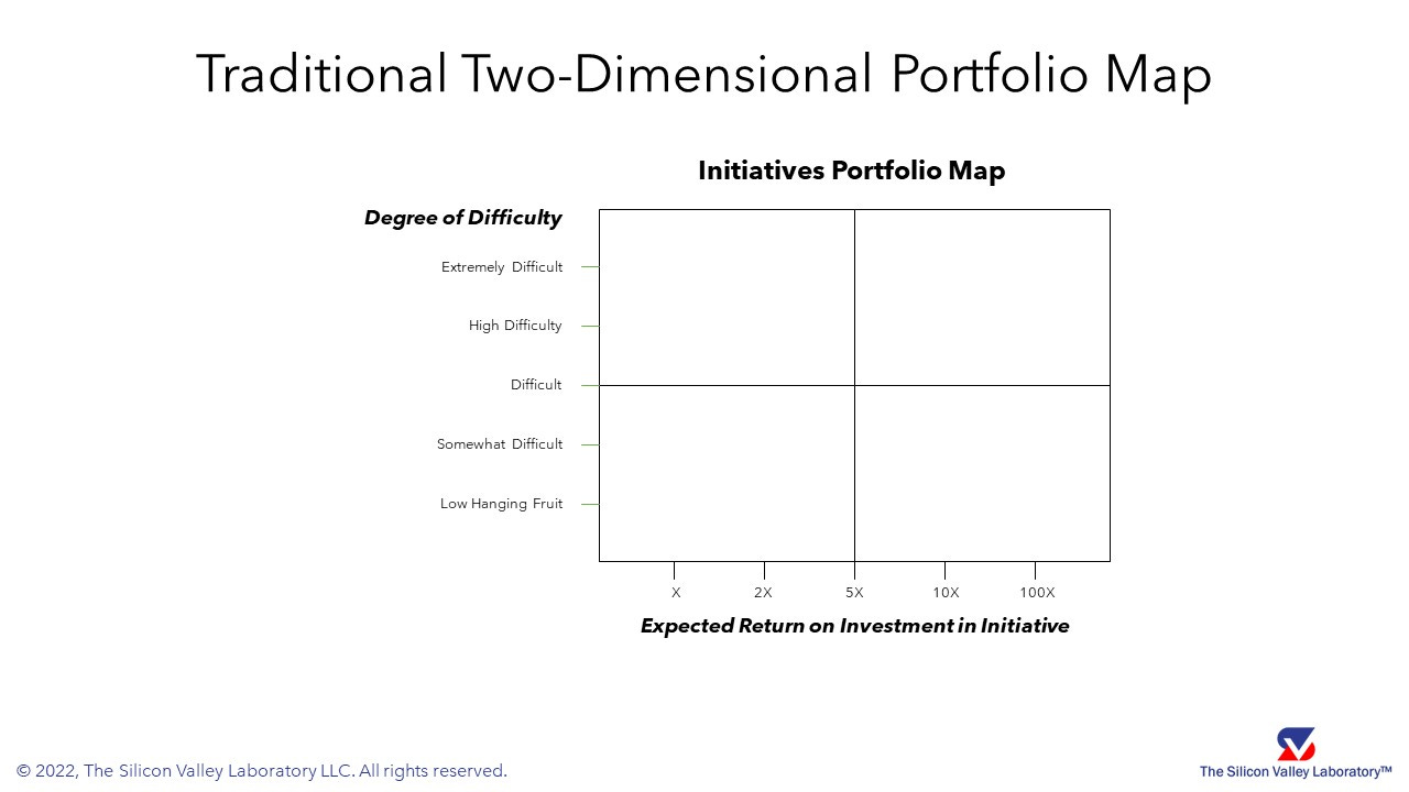
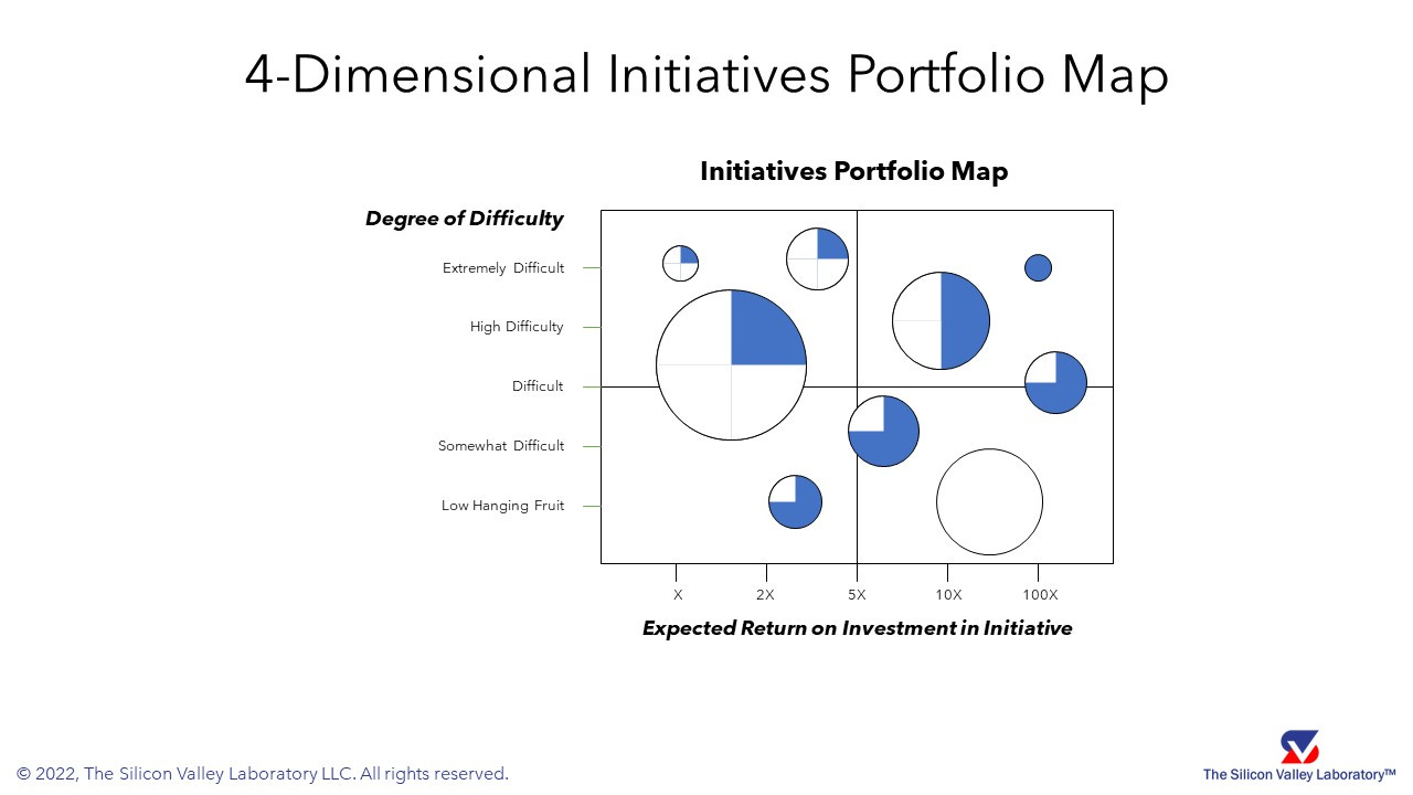
Below is an initiatives framework (or tool), which you might have used before in a workshop or a planning meeting to decide what strategic initiatives your company should execute. Assume the company does not have the resources nor bandwidth to execute all the initiatives. Executives must choose. The old school way is to draw a 2 x 2 grid on a sheet of flip chart paper or on a white board in a workshop setting. Low tech, high touch. On many occasions the tool has proven to be an effective technique for decision-making and achieving alignment amongst an executive team. The two dimensions typically are “Expected Return-on-Investment in an Initiative” and “Degree of Difficulty”.
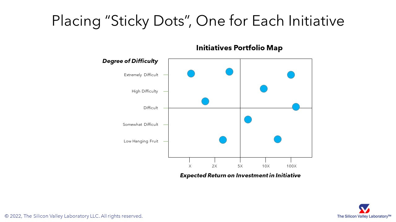
Workshop participants are then asked to place sticky dots on the flip chart paper where each dot represents an initiative under consideration. Visually, executives can begin to weigh the various initiatives against each other and prioritize the set, or portfolio.
We could stop here, but decisions involve more than two dimensions. To accommodate more variables, we can add a third dimension, “Strategy”, and a fourth dimension, “Projected Increase in Net Present Value” (a metric for valuation of a firm), according to the key below.
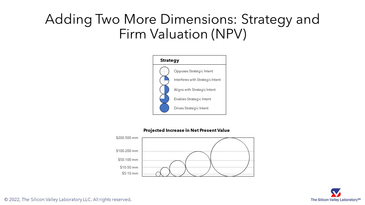
Adding these two additional dimensions, we are now looking at a four-dimensional display of the complexities of making decisions about investing in executing strategic initiatives. As you know, strategy is about what you do and what you do not do. At a glance, executives can visually see the trade-offs of undertaking certain strategic initiatives over others. A more comples portfolio management view emerges.
But wait. There’s more.
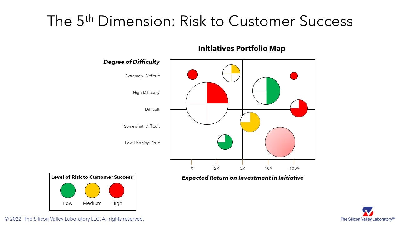
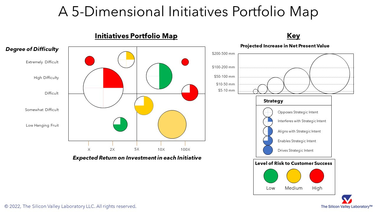
How do customers factor into an executive team’s decision about which initiatives to pursue? And what about risk? Here, we add a blended fifth dimension: “Risk to Customer Success”, represented through the color coding of our initiative circles and partial circles. Pulling all five dimensions together, we have a five-dimensional tool on a two-dimensional medium (flip chart paper, whiteboard, computer display, or PowerPoint slide). The five dimensions shown are Expected ROI, Degree of Difficulty, Strategy, Increase in NPV, and Risk to Customer Success.
More often than not, decision-making using this tool causes much debate among senior executives, middle managers, and front-line workers depending on the application of the framework. Which initiatives are higher priority than others? Which initiatives should be “killed”? Which initiatives should be delayed for a later start? Facilitation techniques for decision support abound, but that is a topic for a later article.
The case shown is for an automotive original equipment manufacturer (OEM) undertaking Digital Transformation at the same time as experiencing a tectonic market shift towards electric vehicles. In this particular case, customer success is defined as brand loyalty to the OEM’s vehicles. Hopefully, a consumer selects the OEM’s electric vehicle thus ensuring an increase in the lifetime value of the customer (LTV).
Aside from Digital Transformation, more applications of the five-dimensional framework exist. We have used this tool for mergers & acquisitions (which functions to integrate now versus later), reengineering (remember re-engineering?), supply chain resilience improvement, product management (in which products or product features to invest), EBITDA improvement (revenue, cost, and cash flow initiatives), and a slew of other situations requiring multi-dimensional decisions.
Big data and data analytics enable people to visualize multiple dimensions on dashboards. However, a dashboard is intended for continual use to track performance (backward looking), monitor operations (current view), and display predictive analytics (forward looking). The main difference between the initiatives portfolio management tool and a dashboard is in its use. Dashboards are moment-to-moment in nature while the portfolio map is more geared towards infrequent, long-term strategic decisions.
For your convenience, here is the portfolio map rendered with keys for each of the five dimensions. Which initiatives would you undertake? Which initiatives would you apply more resources (people, budget, time)? Which would you “kill”? Which would you defer?
If you have questions about this framework, the methods driving the ratings along a particular dimension, and generally, how to use the tool to rise above Flatland, please let me know leaving a comment or by emailing me (rchen@thesvlab.com). I will get back to you shortly.